Doula – Redesigning Support for the Final Phase of Pregnancy
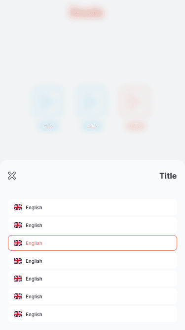
Doula is a pregnancy support app that offers audio guidance to help manage pain during contractions and provides users with statistics to track their contractions. With multilingual support, the app is designed to be accessible for expectant mothers across different regions.
Despite its core functionality being valuable, Doula lacked a symptom tracker—a key feature many users expect to monitor their well-being throughout pregnancy. The visual style of the app also felt outdated and clinical, failing to deliver the warmth and reassurance users were seeking. Feedback highlighted a sense of disconnection, with users craving a more personal, comforting, and emotionally supportive experience during this important phase of life.
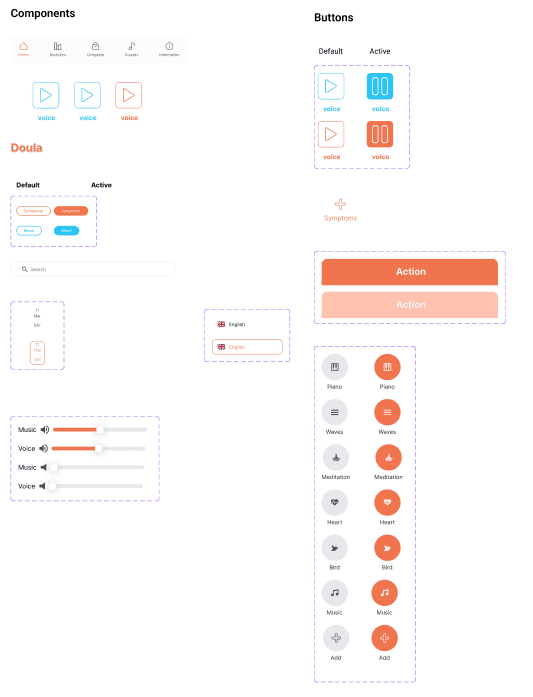
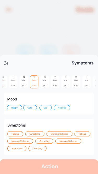
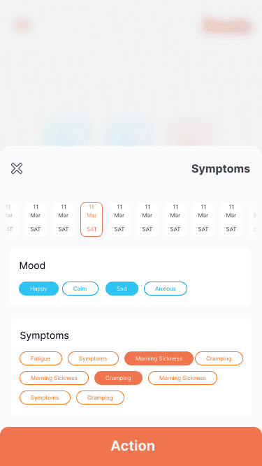
I began by analyzing the existing app structure and user interface to identify key pain points in usability and emotional resonance. Based on this evaluation, I designed a symptom tracking module that enables users to log their daily experiences, including mood changes and physical symptoms. To support meaningful insights, I included clear visual summaries that help users recognize patterns over time and easily share this data with healthcare providers.
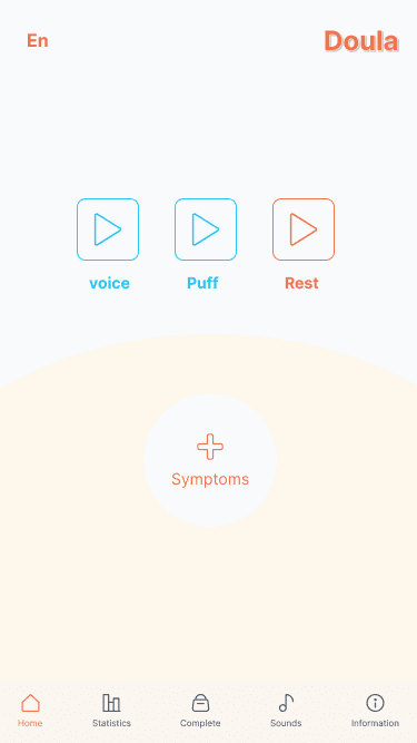
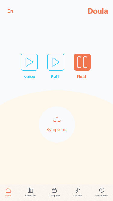
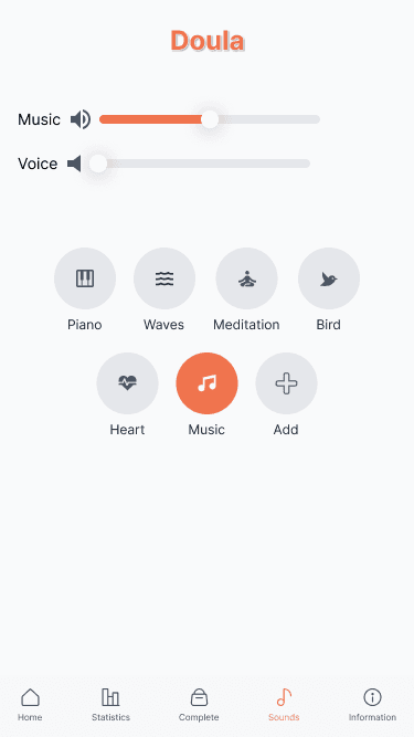
For the UI redesign, I implemented a softer, more nurturing color palette to evoke a sense of calm and trust. I incorporated rounded components and smooth transitions to create a warmer, more approachable experience. Additionally, I reorganized the layout to improve usability and ensure clarity—especially during high-stress moments like contractions—making the interface more intuitive and supportive.
The redesigned concept for the Doula app offers a more holistic and emotionally supportive experience for expectant mothers. By introducing a symptom tracking feature, the app extends its utility beyond labor, allowing users to engage with it throughout their pregnancy journey. The addition of visual summaries empowers users to monitor their health more effectively and facilitates better communication with healthcare professionals.
The refreshed visual design and layout significantly improve usability and emotional tone. Softer colors, rounded elements, and smoother transitions create a calming atmosphere, while the reorganized interface ensures that essential features are accessible and intuitive—even during moments of stress.
Overall, this redesign transforms Doula from a functional contraction tracker into a more personal and compassionate companion—one that supports users both physically and emotionally during one of the most meaningful times in their lives.
Working on the Doula app redesign allowed me to deeply consider how design can impact emotional well-being, especially in sensitive contexts like pregnancy. One of the key takeaways from this project was the importance of empathy in design—understanding not just what users need functionally, but also how they want to feel when using a product during vulnerable moments.
Designing the symptom tracker challenged me to think about how to balance simplicity with depth, ensuring users could easily log their symptoms without feeling overwhelmed. Additionally, refining the UI to feel more soothing and supportive pushed me to be more intentional with color, layout, and micro-interactions.
This project reinforced my belief that good design goes beyond aesthetics—it should support, empower, and connect. I’m proud of the direction this redesign took and am excited to keep exploring ways to design for both usability and emotional resonance in future projects.
Design system
Colors and Icons
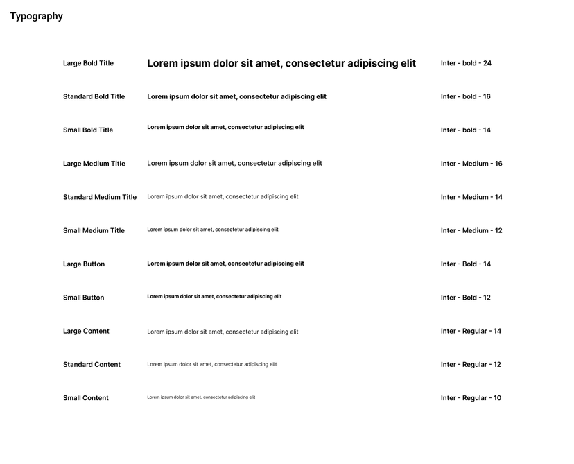
Typography
Components